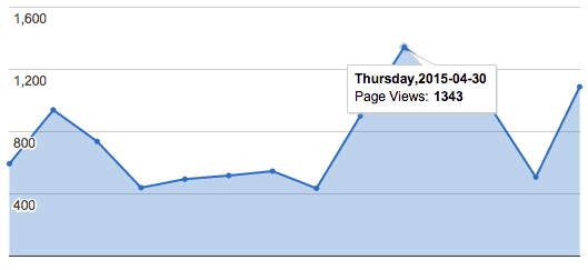
The featured chart illustrates the growth in page views from our recent re-design of a gourmet food producer’s website – a huge increase from the sub 500 page view days, many of which came from mobile devices.
While we cannot promise these results every time, there are rewards for doing things well. And this is a prime example of how taking the time to build and design websites correctly pays dividends.
One of our main goals we wanted to achieve when designing the new site was using a responsive design, which means that you’ll see essentially the same design optimized for your smart phone, tablet and desktop. This practice goes hand in hand with where your website shows up in mobile search results. Google recently released a “mobile-friendly” alert notifying web designers, developers, and owners that they will now be factoring in a website’s mobile-friendliness into their algorithm. Plainly stated, websites which are not mobile friendly, will not perform as well in the Google search results.